The place to speak about Dev's current projects, and everything yet to come
#248990 by catharsis
Thu Oct 07, 2010 4:58 am
swervedriver wrote:Thumbs up!


badump-chh
#248993 by GaiaTimesInfinity
Thu Oct 07, 2010 6:12 am
Sounds like it's going to be great.

mineralinsulated wrote:i for one am relieved that Radial highway didnt make the cut, obviously ive not heard the finished version, but i had imagined that it would 'jar' when listened in relation to the other numbers. on Ki ive always struggled with 'train fire' except of course for that wonderful coda. And i wondered if 'radial highway' would have the same effect.

I was thinking this. Although for me it's more "Quiet Riot" that jars the quiet listen on Ki. I usually listen to my own custom playlist for Ki more than I do the full album, which consists solely of the quieter tracks and starts with "Coast" because I can't listen to "A Monday" ... unless it's a monday :|. The other tracks are great in their own way too but I think I prefer the quieter ones and other tracks like the "Ki" title track for example is just too epic for a normal listen.

mxtrav wrote:Non-sense! Anyone that doesn't deem all of your releases a worthy purchase is clearly not worthy of life.

Amen.
#249098 by Chimairacle
Sat Oct 09, 2010 8:58 am
Telescopes Are Gay wrote:I like it though. It has that New-Age/earthly feel that Dev is gunning for.


It does...but still...papyrus :?
There are a billion and one fonts out there and there's no real reason why you can't design your own typography if you needed to. It would come off a bit unprofessional to use something we've seen before and have become accustomed to in a way.

Besides the font though, I love those covers. I prefer the one on the right, the left one has a bit too much negative space for me..plus the asymmetrical shadows are a nice touch. A lot of the proposed art for Ghost kinda seems very stock photo-ish and generic, but this one really gives off a nice vibe.
#249100 by Estbarul
Sat Oct 09, 2010 9:10 am
Wow that´s very very cool... well done :) I like the one in the right better
#249114 by ppinkham
Sat Oct 09, 2010 12:25 pm
From the music I have heard and from what Dev has said, Ghost will have a more floaty, airy, spacey, folksy feel. I think an image more natural and less processed would suit the cover better.

I think those two designs we are discussing would be awesome album covers, but they just don't seem right here. They would make a great Rush album cover. Maybe even work for the Dark Ghost EP.

Just my opinion, of course. I sure as hell am not Devin. Those may be just what Devin wants, for all I know. lol
#249232 by Robert23
Sat Oct 09, 2010 7:44 pm
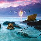
ppinkham wrote:Yeah, Papyrus font is so over-used, it comes off as a bit cheesy. I think those are beautiful images, but just a tad too over-dramatic, IMO. I think in this case, simpler would be better.

This, but with witty cruelty, because I'm too lazy to think for myself.
#249242 by GaiaTimesInfinity
Sun Oct 10, 2010 3:12 am
ppinkham wrote:From the music I have heard and from what Dev has said, Ghost will have a more floaty, airy, spacey, folksy feel. I think an image more natural and less processed would suit the cover better.

And don't forget epic on a huge scale.

Very good work, but not sure I would chose it as is exactly. Forgetting the font, if the right one had a VAST backdrop scene (like my avatar for example), simple and huge simaltaneously sounds good. I think it would suit the ghost sound better. Stones... on the top of mount everest :lol:

Image
#249249 by Robert23
Sun Oct 10, 2010 5:51 am
Abydost wrote:The dark side of Ghost?
Image

promoting my own silly pictures trololol

The Sunset Diaries? The Sun Also Sets? Dr Devin and Mr Townsend?

Who is online

Users browsing this forum: No registered users and 1 guest