A place to share your own music and creative projects.

#104251 by Pisshead
Sun Jan 08, 2006 5:51 am
Giger's the man! Although his books are usually super huge and super expensive (ever seen the Necronomicon's? Both volumes are fucking huge). I have a calendar of his on order and I may pick up a poster collection.

Does anyone here like Hieronymus Bosch? Insane stuff.

Image

Image

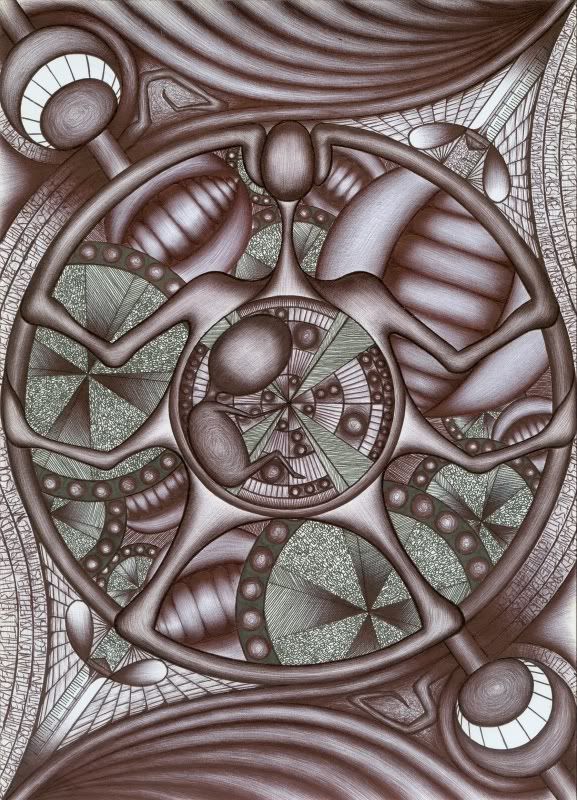
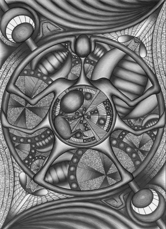
EDIT: Added images, look at the fucking detail..
Last edited by Pisshead on Sun Jan 08, 2006 1:55 pm, edited 1 time in total.

#104336 by CardDinour
Sun Jan 08, 2006 1:36 pm
maybe the reaon you are drawing like this is because you have an alien in you as we speak and as your drawings get more bizarre its getting closer to ripping apart your stomach? :D:D

#141710 by Blazingmonga
Sun Feb 25, 2007 10:57 am
Hey everyone,

I had to dig around to find this thread, but I wanted to post another drawing here. So here I go:

Image

It has been a long time since I have been able to post anything here, and that is because I havent had the time for many of my hobbies. The last year has been particularly traumatic, hectic, terrible and wonderful. I actually started the above drawing on Christmas day 2005. Still, I am glad to finally get it finished. It is the 2nd part of a 4 part series I am still slowly creating. The first part can be seen on the previous page (the image called 'Venality').

This scan has highlighted the difference between the alternate inks I used in this image a bit more than the naked eye would, but I am too lazy to fine tune it. As with my previous images this is A4 smooth card with mainly black biro, though some other inks were also used.

Enjoy! Or not. The choice is yours!

#141726 by Josiah Tobin
Sun Feb 25, 2007 1:02 pm
This is just amazing... The detail here is insane, I can't imagine the amount of effort it would take to create such a sense of depth without any physical layers to the image-- Especially doing it on card instead of digitally.

Then there's that embryo-like object in the middle again, as someone previously mentioned it seems 'alive' somehow-- The entire picture is sort of organic in a very metallic way. This may be an odd comparison to make, but this is sort of how I think Borerer would look if it was visually abstracted and presented in this kind of medium.

I'm not really sure how, but the image sort of brings to mind some of the personal fears and jealousy that always seem to get so under my skin-- fears related to people I hold very dear, I suppose. There are a few things that bring that feeling to mind, though this sort of evokes it in a subtler way... It's really very hard to describe, but suffice to say it reminds me of some things that are very important to me. I really like this image, more so than your others (and your others are fantastic as well), I can't wait to see the rest of the 'series.' You should combine your ambient talents with this kind of art, I think the pairing would be rather stunning.

#141729 by Naffis-kun
Sun Feb 25, 2007 1:55 pm
Cool, there's a Japanese navy flag in the background! :D

#141757 by Persuader
Mon Feb 26, 2007 1:47 am
Awesome drawing Monga. I really like the detail, colour and depth.

#141758 by Blazingmonga
Mon Feb 26, 2007 2:17 am
Naffis-kun wrote:Cool, there's a Japanese navy flag in the background! :D


Huh? Where? If there is, it is not intentional.

Persuader wrote:Awesome drawing Monga. I really like the detail, colour and depth.


Thanks!

Though about the 'colour'...perhaps I would have been better to make it look a bit more realistic. This scan really has skewed the bias between the two kinds of ink. I should probably fix this!

#141811 by Blazingmonga
Tue Feb 27, 2007 1:35 am
Naffis-kun wrote:
Huh? Where? If there is, it is not intentional.


Here :D:
http://img.photobucket.com/albums/v195/ ... SonNET.jpg

compare it to this:
http://www.flagoutlet.ca/images/flags/H ... y%20sm.JPG

I love Japan and I actually painted that flag on my bike.


Oh, THAT drawing...! You realise that I did post a new one, and that this thread is quite old? That is why I was confused. I see what you mean now, and although they are very similar I didnt intend them to be. Obviously when I finished that image I realised it also, ha.

#141870 by Blazingmonga
Tue Feb 27, 2007 2:48 pm
Here are the last 2 images with the colours corrected. I think they both looks much better, much more like the originals.

Phase One: Venality
Image
Phase Two: Profligate
Image

Yay!

#141884 by Ike
Tue Feb 27, 2007 4:45 pm
yay indeed! that's some great stuff :D you should do cover artworks. how long do you work on one of these?

#141885 by Blazingmonga
Tue Feb 27, 2007 4:48 pm
Ike wrote:yay indeed! that's some great stuff :D you should do cover artworks. how long do you work on one of these?


Thanks Ike! Covers would be fun...though I dont think I could really do something on behalf of somebody else. It would come out all weird and monga-like.

I spend a long time on these. The last one took over a year, although that is mainly because it is hard to devote time to this. It requires peace, concentration and good coffee. If I had worked on it every day it probably would have only taken a few weeks!

#141887 by Josiah Tobin
Tue Feb 27, 2007 5:23 pm
Hmm, I actually like the subtle colors of the first ones you posted better, the plain black and white doesn't really create as many associations for me. Though of course, that could just be because I didn't draw them and aren't used to the originals... I've just grown to like the 'incorrect' versions I suppose. :P

#141899 by ASHORIZZOR
Tue Feb 27, 2007 7:03 pm
David, that looks absoluteley brilliant! I hope for you that your job has something to do with that! :o :shock: :wink:

Of course I know it hasn't but if, that would make you a Billionare within minutes!

Grrrrrrrrrreat!

#141918 by Blazingmonga
Wed Feb 28, 2007 1:42 am
Josiah Tobin wrote:Hmm, I actually like the subtle colors of the first ones you posted better, the plain black and white doesn't really create as many associations for me. Though of course, that could just be because I didn't draw them and aren't used to the originals... I've just grown to like the 'incorrect' versions I suppose. :P


Haha, I thought you would say this. I could probably have chosen a '50% colour' version, as there is some tonal difference between the felt tip and biro ink, but to the naked eye they are very similar, so the newer images are more representative.

ASHORIZZOR wrote:David, that looks absoluteley brilliant! I hope for you that your job has something to do with that!

Of course I know it hasn't but if, that would make you a Billionare within minutes!

Grrrrrrrrrreat!


Thank you! I do try and doodle in my job as much as possible. When I make my first billion I will surely give you a few million, just for kicks.

Who is online

Users browsing this forum: No registered users and 1 guest