Talk about whatever you want to here, but stay correct
#200420 by Torbjørn
Tue Jun 02, 2009 2:44 pm
This is the new layout for my bands myspace. Let me know what you think about it! I'm trying to get feedback so I can update it etc etc.

http://www.myspace.com/archaiccessation
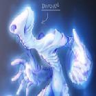
:)

Made with Photoshop CS3 Moving everything around on the myspace was some hacked CSS work in part by me and some girl on the internets names Eileen and the Shows/Tour dates box is an RSS feed reader that reads from an event calendar called RSScalendar.com. Someone at myspace decided to code the shows and music player together, so I decided to go with a better shows date box thing ;)
#200421 by Aden
Tue Jun 02, 2009 3:06 pm
Your page looks good, the re-arranging is very clever. Its clearly not as amazing as some of the pro pages like this or this for example (some pages that stood out to me), but thats because i doubt you've got a degree in this sort of thing have you?

Its very good with the large texture as the background, and i love the fact there is a colour scheme (for example, where you've changed the colours of the brand logo's around the "Video of the Month")... but i think one thing that kind of, makes it seem less "pro" is a lot of the text to be honest. I can't put my finger on why, but i think a lot of it doesn't blend in enough.

But obviously, that's meant to be constructive criticism, its all in all, for an "amateur" page, very good indeed :D

I love myspace art, its awesome, especially now with my widescreen monitor on the top quality pages, they look awesome. :D
#200428 by Torbjørn
Tue Jun 02, 2009 3:32 pm
The main thing is I was going for originality.

I've been doing photoshop work since I was 14 and I have no intent on getting a degree. Degree's are absolutely retarded and if I have to be called an amateur because I do things in an "unconventional" way than so be it.

I'm not getting mad at you, I've just had people say, "well thats not pro work because it doesn't look like this." Every professional I've seen do a myspace does it the same damn way. It's kinda sickening.

As for the text, it doesn't have a color. It blends in with the background. I'm going to be changing some of the text soon. Probably the biography text first. Everything on there except the fonts is original artwork. The "rock" in the background is all original, no repeating parts, not copy past :)
#200442 by TallNerdGuy
Tue Jun 02, 2009 5:56 pm
First off, I dig your site. Definitely gets bonus points for breaking the norm and having that cool rusty, blood-soaked background. The arrangement makes the page kinda long, but for a page that people go to for music, it gives them something to do as they listen to your stuff.

Second, I'm glad I saw that you are going to change the font, because that guttural-ish display font is really hard to read and strains the eyes...the bio, especially. Any font that is exclusively outlined is horrible to use as body copy, also. It messes with the brain, because one is used to seeing specific shapes between corresponding letters, but when those shapes are altered, one has to struggle to put the unfamiliar pieces together.</constructive criticism>

Last, I have a degree in graphic design, and it was not a retarded decision. Different strokes for different folks and everything, but at the same time, I see nothing wrong with pursuing a good education in a field which one is interested in (aside from getting raped financially by colleges). It is impressive that you can do what you do for being self-taught, but don't hate the player, hate the game. When people mention that something you've done doesn't look "professional," they probably don't mean it in terms of professionalism, but in terms of overall design sensibility. Certain things are learned over time...keep creating stuff.
#200447 by Torbjørn
Tue Jun 02, 2009 6:23 pm
TallNerdGuy wrote:First off, I dig your site. Definitely gets bonus points for breaking the norm and having that cool rusty, blood-soaked background. The arrangement makes the page kinda long, but for a page that people go to for music, it gives them something to do as they listen to your stuff.

Second, I'm glad I saw that you are going to change the font, because that guttural-ish display font is really hard to read and strains the eyes...the bio, especially. Any font that is exclusively outlined is horrible to use as body copy, also. It messes with the brain, because one is used to seeing specific shapes between corresponding letters, but when those shapes are altered, one has to struggle to put the unfamiliar pieces together.</constructive criticism>

Last, I have a degree in graphic design, and it was not a retarded decision. Different strokes for different folks and everything, but at the same time, I see nothing wrong with pursuing a good education in a field which one is interested in (aside from getting raped financially by colleges). It is impressive that you can do what you do for being self-taught, but don't hate the player, hate the game. When people mention that something you've done doesn't look "professional," they probably don't mean it in terms of professionalism, but in terms of overall design sensibility. Certain things are learned over time...keep creating stuff.


It's just my opinion for myself. I should have been clear on that sorry. I just don't see why I should get a degree in art when I have the ability to learn by myself. Art is about expression. Someone telling you HOW to express yourself just defeats the purpose. I also find that most people are wrong (including myself) or have biased opinions, which is something that hinders ones ability to learn if they are taught by a teacher. I just don't like teachers shoving ideas down my throat, when I should be coming up with innovations of my own.

Just my two cents.

The design was all done by me but I have two other band members that had their own input. So "sensibility" wise it was to the customers request, if you know what I'm saying. That is why I need feedback (specifically what fonts are terrible etc) so I can show them others opinions on whats wrong so I can change it without them bitching "oh it's fine, you don't need to change anything tor, everything is fine!")

Like I said, in a band environment, I can't just change something myselfself and expect the other members to follow. I do appreciate the constructive criticism from you guys though. I know I'm not the best photoshop artist. I'm just sick of being treated like I'm an "amateur" because I do things the way I want them done, or because I listen to customers and design things to their vision, rather than using a template (which most of the myspace designs I've seen are pretty much the same)

But I thank both of you for the help. Which fonts exactly are hard on your eyes? I've known for a while the bio needs to be changed. What about the quotes from other bands (the "what others are saying about Archaic Cessation") etc.

Thanks
Torbjørn
#200450 by Aden
Tue Jun 02, 2009 6:54 pm
I know what you mean when you say "I just don't like teachers shoving ideas down my throat"... I did art at school and it was the biggest piece of shit ever. We spent day after day learning the styles of all the famous, successful artists and doing excersises where we had to immitate their style.

Also, I wasn't saying "You should do a degree before you do something like that"... I enjoy doing the same thing and i'm self taught, I just wasn't sure how you wanted your feedback. Would you have been annoyed if i compared it to the "pro" pages? Would you want me to tell you its perfect?

When I look at myspace pages, i tend to look more at the artwork within, rather than the layout. I look at the photoshop stage over the scripting stage so to speak. So when it comes to "pages being all the same" - to me they're not, because all of the artwork is different, and thats what i care about more.

I'm crap at arguing/criticism, so i'll just shut up.
#200451 by Torbjørn
Tue Jun 02, 2009 7:01 pm
I liked your post. I just don't like the common idea of a "pro" page. It has nothing to do with you. It's just the general layout is the same. The art for this page is fitting of our album cover/shirts/music. It's the "pro" layout design that I don't like. A top banner with the navigation on the top banner and then the background image that scrolls with the page. There are just too many empty spots on that page that are never going to be filled (although there are a few on my page, but I have plans for them).

I'm not saying your criticism was bad. I didn't think you said I should get a degree, but I think people who do have a degree in something tend to have much more boring, cookie cutter designs. Not all of them, just most of them. Especially the people who do a lot of designs for a lot of bands.
#200453 by TallNerdGuy
Tue Jun 02, 2009 8:22 pm
If you have had teachers who try to teach you how exactly to express yourself, then they were doing it wrong. A good teacher would inform you of the necessary tools, mediums, and techniques to express yourself...sort of giving you the mortar, bricks, and solid foundation and letting you build your own building. There really is no point of telling someone to go do a creative task exactly as they do it, because then it wouldn't be creative. They'd treat you like a bunch of robots. But...if they don't tell, but inform enough to inspire and then let originality take it from there, that is a good teacher.

And learning the styles and methods of old artists and art periods isn't exactly terrible. It can be easy to see learning that stuff as boring and limiting yourself to that one style, but its not so much about duplicating the way it was done as it is about utilizing elements from how it was done. No one is going to get anywhere remaking a Van Gogh painting (unless its their job to restore Van Gogh paintings, but that's beside the point), but artists will appreciate seeing small elements of various different styles all in one new painting, as if it were some kind of puzzle. It shows versatility, and in a strange way, originality. Look at a lot of today's musicians...its getting to the point of a band's sound being built around an influence of another band, which in turn, was based around the influence of another band. Sometimes originality can be spawned from the inspiration of existing originality (if done in a way that's not plagiarism). Of course, that's not saying that one should slave over history books all day just to get inspired. If someone isn't interested in what already exists, then why push it? As you said, Torbjorn, art is about expression of the self.

As for the template look, they do get overused, and really cut back on giving business to freelance designers who design from scratch. Its another way for "the man" to cut down on production cost and time, as well as down-time. If anything, an original designer can benefit from all those cookie cutter designs because it allows a new design to engage the viewer and get them interested. But! One plus of the templates: The user almost always knows where to look when it comes to the basics (navigation) and the main focus of the page (the music player, comments, etc). If a design deviates too far away from the original laid out by the myspace, then the user might get pissed. Then again, it all boils down to the vision, and you never know where the next big design style will come from...

The fonts that I think might be tough for viewers to read are mainly the band roles/instruments beneath your members names, the quote from Zero Hour (nice, btw), and the band's logo at the top of the page is kinda blurry in its thinner parts.
#200454 by Torbjørn
Tue Jun 02, 2009 8:39 pm
TallNerdGuy wrote:One plus of the templates: The user almost always knows where to look when it comes to the basics (navigation) and the main focus of the page (the music player, comments, etc). If a design deviates too far away from the original laid out by the myspace, then the user might get pissed. Then again, it all boils down to the vision, and you never know where the next big design style will come from...

The fonts that I think might be tough for viewers to read are mainly the band roles/instruments beneath your members names, the quote from Zero Hour (nice, btw), and the band's logo at the top of the page is kinda blurry in its thinner parts.


Yea, I know what you mean about that. I tried to keep that in mind, and I think I did a good enough job putting everything in front of everyone. I'm going to look for more fonts tonight. I want to do a major update by my birthday (june 16th). I kinda like the blurriness of the logo in some of it, as it blends in with the background. The actual logo looks different in is doesn't have those edges around it. The h and the i look a bit weird. But there isn't much I can do about that short of changing the logo.

Most of the teachers in Arizona are here to get paid. I've gotten F's on projects for being original or doing things that are too far ahead in the material (stuff I knew how to do before I took the class). It's kinda lame. They basically want you to do those projects the way they tell you too. In fact, every art school I've had a friend attend in this state prints you up a list of actions to take to get to the final project. It's basically just tutorials. I know because I'm the "go to" guy for all my friends who are doing photoshop work in school.

It's lame, but I find I learn better on my own anyways. In fact with the aid of a few books, that is how I am currently learning Electronic Engineering. Hoping to make my own amplifier someday. I've also learned how to record music and create ambient/movie/game sound tracks all on my own.

But I can't draw for shit. :( I am, so to say, a man of electronic arts! (not the shitty video game company). I enjoy it though, and I'm also afraid that if I went to a really good art school it could destroy the fun of exploring for me.
#200559 by Amber
Wed Jun 03, 2009 5:11 pm
I like it. The font in the bio is a little hard to read though, maybe a solid colour instead of it having the same colours as the back ground might help (Maybe like a deep red, or if you want to stand out more, a olive colour will stand out because it's the opposite colour.)

And while the art debate is going, I've studied two years of art, and almost a year of fashion now. Teachers are there to teach how techinques, and finding out new ways on how you can do things to express yourself, or your concepts. Occasionally this can seem like "You must copy this art style." But that's not what it's about.

90% of artists get stuck into their own way of doing things, which can repeat on itself, and not open up to new things unless forced too. Not always true of course, but that's how a lot are. If nothing else, it's useful knowing you have other tricks of the trade up your sleeve if you need them. And to do "Look at me, I have qualifications to create things." :P

Shame I learnt all of this after I finished my art course. :P

Who is online

Users browsing this forum: Antirakeshorm, MicrozaJen, SaburaMeapy, VenzaiKAP, Zaimkoledox, Zaineaincon and 40 guests